Tuesday, 3 December 2013

Assignment 3 Colour

My photo's for assignment 3 on colour relationships;

Photo's 1-4 Colour harmony through complimentary colours

1
2
3

4


Photo's 5-8 Colour harmony through similar colours

5
6

7

8


Photo's 9-12  Colour contrast through contrasting colours

9
10


11


12
Photo's 13-16  Colour accent

14
13


15
16

Monday, 2 December 2013

Reflections

I'm about to start the next module on Light and I'm really excited about this. Light has always fascinated me and I'm hoping to develop a deeper understanding about how to use it more effectively in my photos.
I've just had my feed back from assignment 3 on colour and reading through I agree with the criticisms
and comments. I am determined to approach this next section in a more artistic and individual way. I'm planning to experiment more with natural light although these grey overcast days don't feel particularly inspiring especially when I leave for work in the dark and then get home in the dark…. I'm most definitely not a winter person. I'm hoping we get some of those crisp sunny days around christmas when the sun is low in the sky as that's always interesting light.
My never ending struggle for time holds me back so much, artistic time is such a rare commodity in my existence
I'm off to read through the next section before falling asleep.
Well here goes…….

Sunday, 10 November 2013

Exercise - Colours into tones in Black and White

In this exercise I have taken a photo of a group of coloured objects, in this case wooden bricks from the boys toy box. They are very solid strong colours. I have grouped them around a piece of neutral grey card. I have then processed the original colour picture 4 times. Firstly into greyscale using photoshops default settings. Then I have applied a colour filter (either red, blue, yellow or green) before applying the greyscale conversion. This has a marked effect on the resultant black and white image.

Blue filter

The blue filter in this instance has a general darkening effect on the whole frame which I could have  compensated for in the software I used (photoshop) The red appears much darker mainly blocked by the blue filter, it has a similar affect but not as strongly on the green and yellow but what is surprising for me in  this case it still affects the blue blocks too. It may be that there is a different wavelength of light coming from the blue bricks and those being allowed to pass by the blue filter, but I understand what the results should be… the blue blocks should have appeared lighter.


Green Filter
The green filter has blocked red light from the red bricks and made them appear darker, a lesser affect on the blue bricks but hasn't really affected the green and yellow bricks. These are the results I would have expected.
red filter
The red filter has made the red bricks appear lighter, and significantly darkened the green and blue bricks just as expected.
yellow filter
The yellow filter has significantly lightened the yellow bricks and the green bricks to a lesser extent but not really affected the blue and red bricks greatly.

Default B+W
I have learnt in this exercise how to darken and light lent tonal elements in  a black and white photograph using coloured filters. This is a really useful way of controlling the tones in the monochrome image.

Remembrance Sunday

As my theme at the moment is colour I felt it was appropriate to upload this amazing photo in remembrance of my Great grandfather John Reynolds who gave his life in the WW1 battle of Loos in 1915, my Great Uncle Jack Reynolds who gave his life in WW2 as a despatch rider and my Grandfather John Cooling who got left behind at Dunkirk behind enemy lines, missing in action for months but eventually made it safely home by fishing boat. Rest in peace.

(photo source - enpundit.com)
I love the deep blood red colour of this field of poppies working well in complement with the green beneath and behind and contrasting agains the blue sky. The iconic silhouette of the horse on the hillside represents to me the spirit free from worldly life standing proudly on the horizon.

Monday, 4 November 2013

Colour relationships continued....

In this second part of the last exercise I have chosen 4 photos that really appeal to me using these colour relationships


In this first photo I caught the light illuminating the partially translucent leaves and really bringing out out the autumnal colours. Against the matt drab grey background I imagined a small fire with the reddish tinges on the edges of the yellow leaf flames.


I love this picture, the blues and greens of the sea accented in a beautifully balanced way by the bright pink, red and green buoys, the diagonal balancing of the dark and light tones in the water add to this along the same diagonal.


This picture is of my favourite little town in France - Brigueuil (Charente) I love the relationship between the golden orange glow of the sunset on the stonework set against the pale grey blue of the dusk sky. The blue and orange are in the ratio of roughly 2:1 which fits in with Von Goethe's theory on colour.

The high contrast between the violet purple and green in this last photo works beautifully. I find the relationship between these to colours exciting. The flower is so defined as an accent to it's background, it has a little imbalance and tension which I find appealing.


Sunday, 3 November 2013

Colour relationships

In this exercise I am experimenting with the relationships of the primary and secondary colours.

In the first part I have taken 3 photographs of the primary colours with their opposite secondary colour from the colour wheel. I have also balanced the ratio of colours in proportion as suggested by J.W.Goethe the German poet and playwright. I love these contrasts of colours, my very favourite is the yellow/purple combination in the third photo.


Red : Green  ( 1:1 )


Orange : Blue ( 1:2 )


Yellow : Purple ( 1:3 )

Exercise - Primary and Secondary Colours

I am exploring, in this exercise the primary and secondary colours. I have taken a series of 18 photos each with a particular colour dominating the frame. I have taken each shot of the six colours at correct exposure and then one stop higher and lower to see the effect on the colour in each case. I have only uploaded a single to my blog for 'data capacity' sake but as in the previous exercise it has shown me that under exposing one stop helps to add depth and richness to the colour and over exposing tends to 'bleach out' the colour.
I have used exclusively natural colours rather than man-made paint colours which would have been easier to find. A trip to the local fruit and veg shop provided me with all the colours I needed except blue which is a less common colour in nature hence resorting to the sky. I am really pleased with the results generally and used the macro setting on my nikon zoom lens for the close-up work.

Primary Colours (based on the standard colour circle)

Red


Blue

Yellow


Secondary Colours

Purple


 Orange

 Green

Monday, 21 October 2013

Exercise- control the strength of colour

In this exercise I have taken 5 shots of the same red 'T shirt'. With the camera in completely manual mode I have started from a setting of 1/2 stop under exposed and then increased the aperture one stop for each of the following shots. The shutter speed has been kept at 1/125 second.


f18
f16
f14
f13
f11


The under exposed shot seems to have a richer deeper colour apart from just being darker, as the exposure increases the colour gets more 'washed out' looking or less rich. I really like the richness in the under exposed frame and the strong colour. This exercise shows how the intensity of colour varies with exposure not just the brightness varying.


Thursday, 3 October 2013

Colour

Life is still manically busy at the moment  but I began taking the photo's for 'assignment 3-Colour' today and have been enjoying the exercises which I will upload shortly. I have been playing with my watercolour paints too as re-examining the colour wheel and the way we perceive colour has been quite inspiring.
These two photo's I took earlier in the year make it hard to believe that such vivid and colourful contrasts exist in the natural environment. I love the way the colours work together.


Tuesday, 1 October 2013


Assignment 2

Elements of design


Scenes around Stroud 
I have decided to base my second assignment on images I have taken around the Gloucestershire town of Stroud. This is a place which is new to me, I am here for work. My change of job has brought me to this interesting, arty, creative and organically busy place, perfect for my new career running a recording studio. It’s a melting pot of ideas a bit like the town which, to me, is a mix of the best of Bath and Cheltenham with a bit of aging Victorian industrial grit which is reminiscent, on my first impressions, of towns I visited ‘up North’ like Rochdale, Oldham and Macclesfield. On deeper investigation Stroud shares a similar heritage in the mill trade, famous for producing military cloth in the British Red and Billiard table Green. Stroud is bustling with life, busy markets, wealthy people alongside those struggling with life, but overall a rich sense thriving inspiration. I am hooked……

Photograph 1. The post-box.  (A single point dominating the frame) I was drawn to the colour against the Cotswold stone wall, such an English symbol harking back to another time, a golden age, and the same red as Stroud’s famous military cloth.

Photograph 2.   Telephone Pole (2 points in the frame)
I love the rustic aging wood, preserved by tar with its old labels numbering and dating, the 2 points in the frame, and older than me…just!


Photograph 3 
 The Square root of windows (several points in a shape)


The 4 windows, all square and all so different.


They caught my eye and so representative of this town, a jumble of styles, eclectic, characterful and like the sign says Ruff’n’Ready in a comfortable charming way, like the buskers I’ve met in the street. How the white glossed cheap modern frame sits in the old wall alongside the craftsmanship of the leaded glass, key-stoned and cut stone of a Jayne Austin era.


Photograph 4 Blue tiles      (horizontal and vertical lines)

I love the colour of these old tiles on a shops wall and the way they are worn by time. Years of scratching by shopping bags, buttons, bikes and boots have left a mature patina like a great wine or ancient coin. The flare from the flash on my Nikon D80 which unfortunately decided to trigger (the D80 struggles in low light) helps to highlight the imperfections but leaves a glare I don’t like…. I must go back and take these again earlier in the day to capture the beauty of the colours.


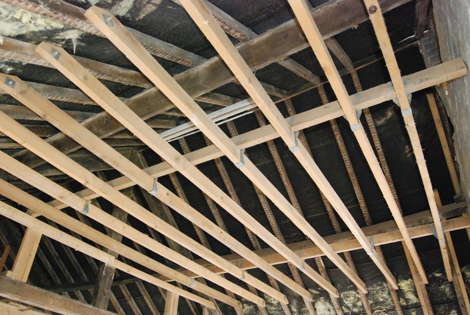
Photograph 5 Building works (diagonals)
Calling in to the old brickworks to see how the building work is progressing for the new recording studios in Bath Road, I took the opportunity to get a frame of diagonals which works really well. The geometry of the roof trusses and false ceiling joists from this perspective fan out across the frame.


Photograph 6a Modern Canal Bridge (curves)

Photograph 6b Under the Bridge (curves)

These two photos are put together as they are taken from almost the same position just turning around 180degrees. They are a juxtaposition of two different ages, both bridges over the canal in Stroud. 6a is a 1990’s construction and very clean and modern whereas 6b is the crumbling relic of the early Victorian era. I love the swirl of the foreground, slightly defocused…like a time tunnel and the murky look of the lock gates and water. I like the sense of movement curves add to the frame and lead the eye.


Photograph 7  Stroud Cemetery (distinctive shapes)
My expeditions around Stroud have lead me to the old Victorian cemetery and I noticed the distinctive shape of the cross, scattered throughout the overgrown sea of gravestones, themselves all distinctive in design, but it was the crosses that stood out being a huge icon, an image, a fashion accessory and Christian symbology. The eye almost seeks them out in the frame. Having had a strongly religious upbringing they have always had a presence in my life 
It then struck me how distinctive many shapes connected with religion are, for example the steeple: (photograph 7b)


Photograph 8a Spillmans Pitch      (Implied Triangles)  
The perspective of the road heading off into the distance, exaggerated by the steepness of ‘Spillman’s pitch’ forms a strong implied triangle in the frame. I love the organic jumble of Stroud which is clear in this photo of the steepest road in the area.


Photograph 8b Majestic (implied triangle)

This magnificent old building near the church in the old part of Stroud is quite spectacular. I like the strong triangle implied by the windows and topped by the roof apex. I would love to know more about the history of this building as it stands so majestically.

Photograph 9a Railway Viaduct  (Rhythm)

The huge curved brick spans of the Victorian railway viaduct are incredible, the sheer scale and the manpower that must have been used to construct it can’t fail to impress as you walk beneath. The huge construction splits Stroud in half as the viaduct goes right through the valley where the town nestles.


Photograph 9b workshop & fence (Rhythm)
This workshop caught my eye as the strong rectangular rhythm of the windows was enhanced by the fence and tyres. I even liked the monochrome feel of the colours in the frame. Everything just works by luck even the rusting brackets for the guttering.


Photograph 10a Brickwork Pattern (patterns)

These patterns in the brickwork caught my attention and from what I could work out seemed to be from the 1970s or early 1980s, another era in the jumble of Stroud. The light was a bit overcast when I took the photo and I think it would have definitely improved the shot with some light bringing out the 3dimensional detail with some shadowing perhaps in the evening when the sun was low in the sky.
Photograph 10b Lime green squares (patterns)

This pattern in the wall of a 1960s building is very distinctive and a dated retro chic about it. It works well in the frame as the colour green stands out so well against the orange brown of the brick so I am pleased with this photo.
Self assessment of assignment
I feel I have done quite well with this assignment although it’s not easy to find a shot which represents exactly what you want. I’ve had multiple trips out with my camera around Stroud and have a good collection of photo’s for my library which haven’t been used in this particular work but ones I am really pleased with. It has been a useful exercise in noticing more about street details and also in getting to know more about this town to which I am a newcomer. I also found I got frustrated that I couldn’t necessarily get time when the best light is to be had due to my work. I have an ongoing issue with the fact that my Nikon D80 really struggles in low light.