Assignment 2
Elements of design
Scenes around Stroud
I have decided to base my second assignment on images I have taken around the Gloucestershire town of Stroud. This is a place which is new to me, I am here for work. My change of job has brought me to this interesting, arty, creative and organically busy place, perfect for my new career running a recording studio. It’s a melting pot of ideas a bit like the town which, to me, is a mix of the best of Bath and Cheltenham with a bit of aging Victorian industrial grit which is reminiscent, on my first impressions, of towns I visited ‘up North’ like Rochdale, Oldham and Macclesfield. On deeper investigation Stroud shares a similar heritage in the mill trade, famous for producing military cloth in the British Red and Billiard table Green. Stroud is bustling with life, busy markets, wealthy people alongside those struggling with life, but overall a rich sense thriving inspiration. I am hooked……
Photograph 1. The post-box. (A single point dominating the frame) I was drawn to the colour against the Cotswold stone wall, such an English symbol harking back to another time, a golden age, and the same red as Stroud’s famous military cloth.
Photograph 2. Telephone Pole (2 points in the frame)
I love the rustic aging wood, preserved by tar with its old labels numbering and dating, the 2 points in the frame, and older than me…just!
Photograph 3
The Square root of windows (several points in a shape)
The 4 windows, all square and all so different.
They caught my eye and so representative of this town, a jumble of styles, eclectic, characterful and like the sign says Ruff’n’Ready in a comfortable charming way, like the buskers I’ve met in the street. How the white glossed cheap modern frame sits in the old wall alongside the craftsmanship of the leaded glass, key-stoned and cut stone of a Jayne Austin era.
Photograph 4 Blue tiles (horizontal and vertical lines)
I love the colour of these old tiles on a shops wall and the way they are worn by time. Years of scratching by shopping bags, buttons, bikes and boots have left a mature patina like a great wine or ancient coin. The flare from the flash on my Nikon D80 which unfortunately decided to trigger (the D80 struggles in low light) helps to highlight the imperfections but leaves a glare I don’t like…. I must go back and take these again earlier in the day to capture the beauty of the colours.
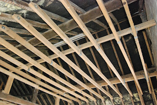
Photograph 5 Building works (diagonals)
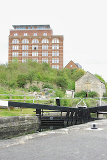
Calling in to the old brickworks to see how the building work is progressing for the new recording studios in Bath Road, I took the opportunity to get a frame of diagonals which works really well. The geometry of the roof trusses and false ceiling joists from this perspective fan out across the frame.
Photograph 6a Modern Canal Bridge (curves)
Photograph 6b Under the Bridge (curves)
These two photos are put together as they are taken from almost the same position just turning around 180degrees. They are a juxtaposition of two different ages, both bridges over the canal in Stroud. 6a is a 1990’s construction and very clean and modern whereas 6b is the crumbling relic of the early Victorian era. I love the swirl of the foreground, slightly defocused…like a time tunnel and the murky look of the lock gates and water. I like the sense of movement curves add to the frame and lead the eye.
Photograph 7 Stroud Cemetery (distinctive shapes)
My expeditions around Stroud have lead me to the old Victorian cemetery and I noticed the distinctive shape of the cross, scattered throughout the overgrown sea of gravestones, themselves all distinctive in design, but it was the crosses that stood out being a huge icon, an image, a fashion accessory and Christian symbology. The eye almost seeks them out in the frame. Having had a strongly religious upbringing they have always had a presence in my life
It then struck me how distinctive many shapes connected with religion are, for example the steeple: (photograph 7b)
Photograph 8a Spillmans Pitch (Implied Triangles)
The perspective of the road heading off into the distance, exaggerated by the steepness of ‘Spillman’s pitch’ forms a strong implied triangle in the frame. I love the organic jumble of Stroud which is clear in this photo of the steepest road in the area.
Photograph 8b Majestic (implied triangle)
This magnificent old building near the church in the old part of Stroud is quite spectacular. I like the strong triangle implied by the windows and topped by the roof apex. I would love to know more about the history of this building as it stands so majestically.
Photograph 9a Railway Viaduct (Rhythm)

The huge curved brick spans of the Victorian railway viaduct are incredible, the sheer scale and the manpower that must have been used to construct it can’t fail to impress as you walk beneath. The huge construction splits Stroud in half as the viaduct goes right through the valley where the town nestles.
Photograph 9b workshop & fence (Rhythm)
This workshop caught my eye as the strong rectangular rhythm of the windows was enhanced by the fence and tyres. I even liked the monochrome feel of the colours in the frame. Everything just works by luck even the rusting brackets for the guttering.
Photograph 10a Brickwork Pattern (patterns)
These patterns in the brickwork caught my attention and from what I could work out seemed to be from the 1970s or early 1980s, another era in the jumble of Stroud. The light was a bit overcast when I took the photo and I think it would have definitely improved the shot with some light bringing out the 3dimensional detail with some shadowing perhaps in the evening when the sun was low in the sky.
Photograph 10b Lime green squares (patterns)
This pattern in the wall of a 1960s building is very distinctive and a dated retro chic about it. It works well in the frame as the colour green stands out so well against the orange brown of the brick so I am pleased with this photo.
Self assessment of assignment
I feel I have done quite well with this assignment although it’s not easy to find a shot which represents exactly what you want. I’ve had multiple trips out with my camera around Stroud and have a good collection of photo’s for my library which haven’t been used in this particular work but ones I am really pleased with. It has been a useful exercise in noticing more about street details and also in getting to know more about this town to which I am a newcomer. I also found I got frustrated that I couldn’t necessarily get time when the best light is to be had due to my work. I have an ongoing issue with the fact that my Nikon D80 really struggles in low light.


